Revisiting Unit Trust of India HQ
In 2023, evolving needs of the organisation necessitated the need for change and readaptation of some of the existing spaces. We were able to do this without compromising the original design principles enunciated 27 years ago.
We explored the built in flexibility in the original structure that employed clear 14m spans without any internal structural impediment.
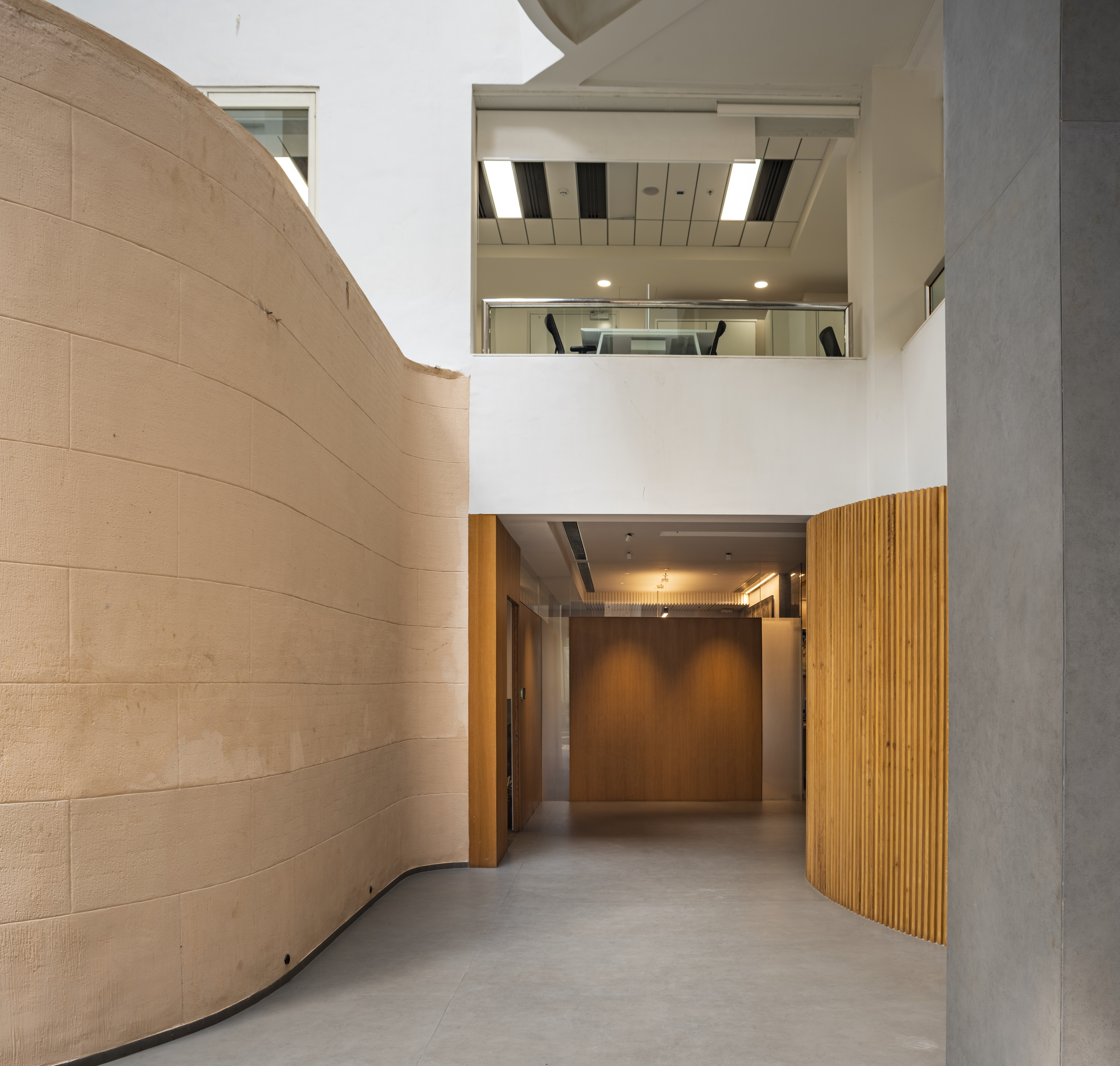
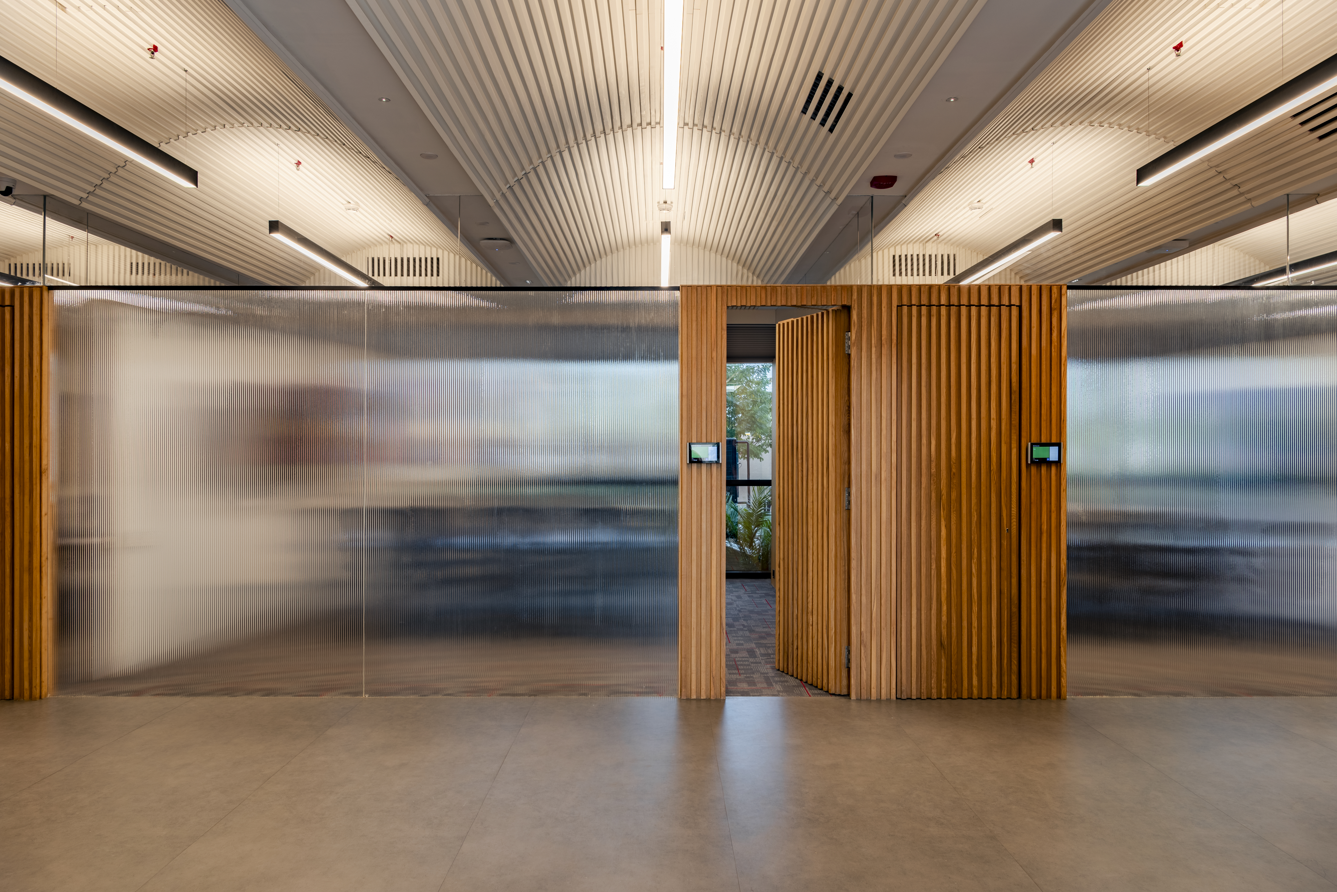
So, whilst retaining the structural geometry of the steel trusses which allow the ducts and services to pass through them at pre-ordained points, we chose to break the rectilinear configuration of the structure. We introduced a series of curvilinear forms of stirated wood that simply appear like scattered sculptures in the landscape.

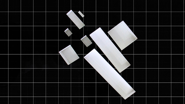
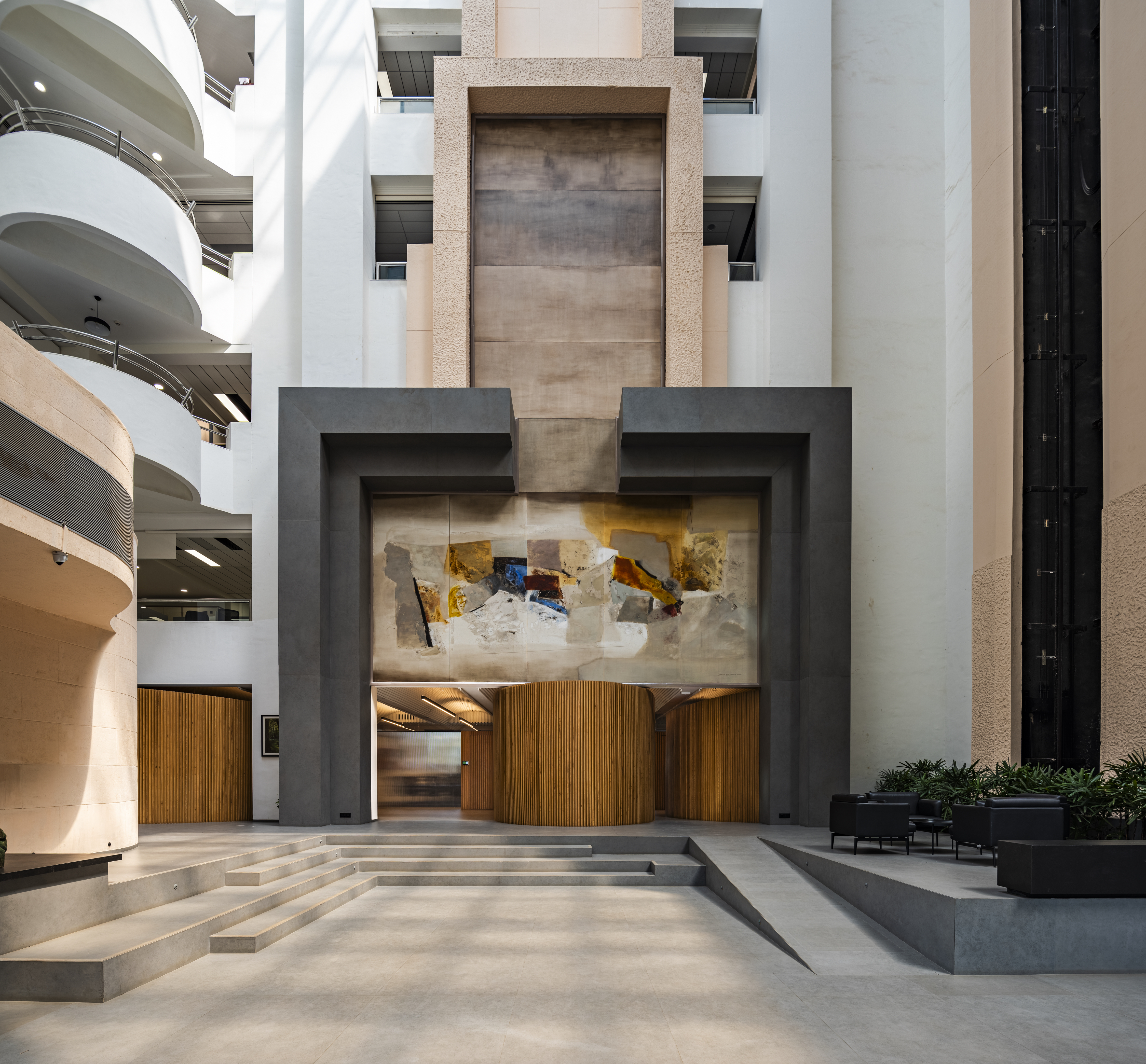
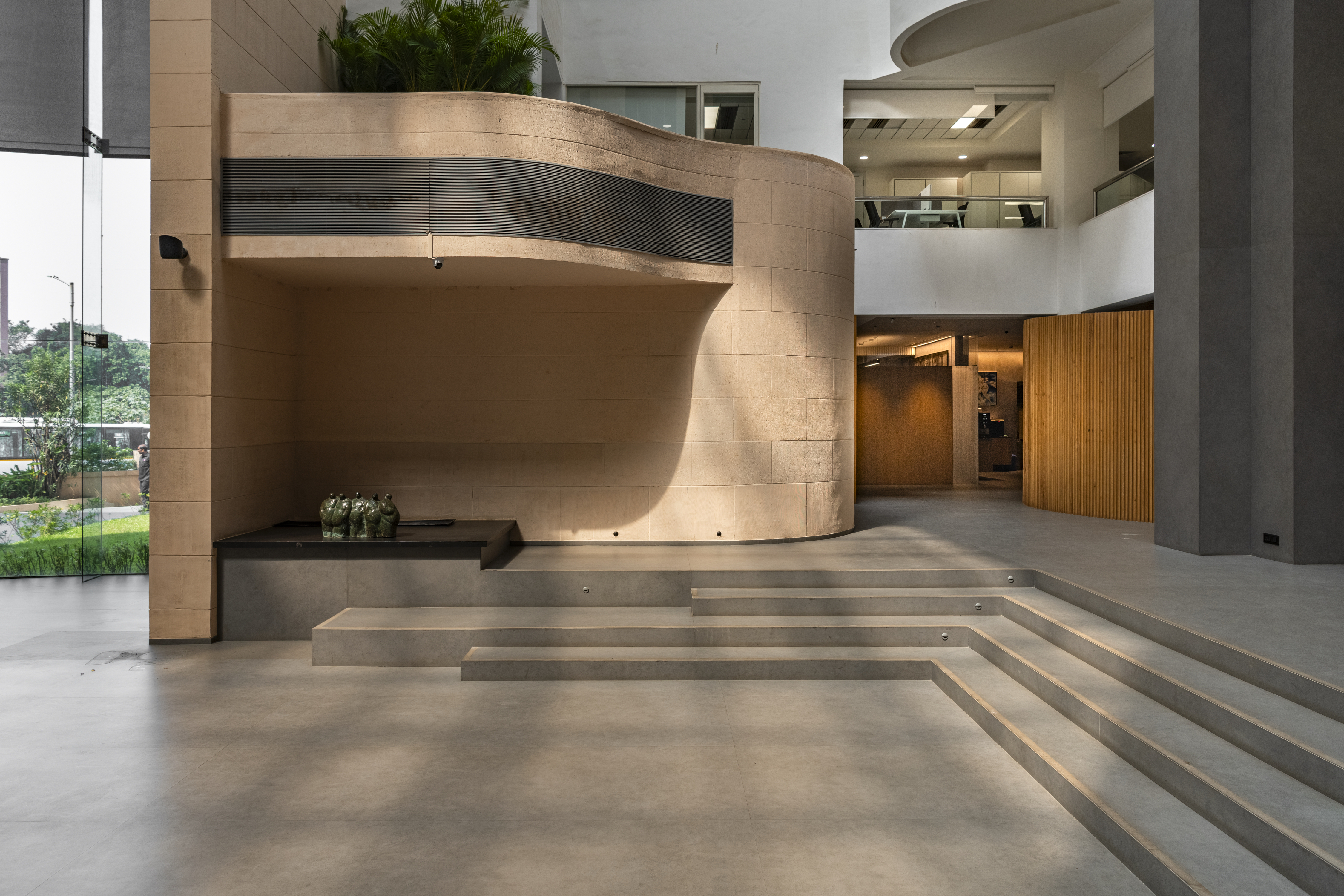
The original design consists of two cantilevered arms with pristine glass prisms that part and reveal the curved 'malad' crete wall that enfolds the atrium. Metal sculptures float on the two panels, surrounded by glass, representing balance.
The atrium ceiling was conceived as both an originating and a culmination point from where the entire structure begins and cascades down. Paintings by Lakshman Shreshtha mark the east and the west of the atrium, symbolising the rising and the setting sun.
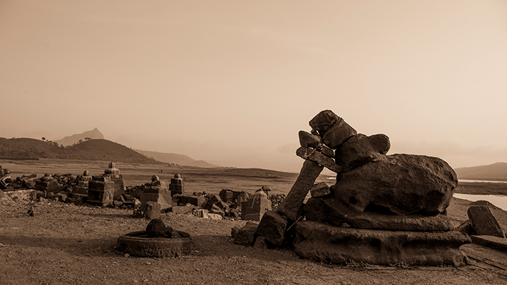
Other factors that influenced the design were the history of Bombay, from the Buddhist rock-cut caves of Elephanta to the impressive Gothic Malad stone colonial buildings and edifices. Combined with these was my own experiment and foray into looking 'inward' and spiritual discovery following the path and tenets laid down by the yogis.

As the first building designed in BKC, the Unit Trust of India HQ was envisaged to project both the stability and security for the unit-holders, who numbered more than 10 million, whilst projecting the aspirations of an organisation with a progressive and futuristic outlook.
The resultant product, I think, is an amalgamation of both the historical influences and their contemporary adaptations.

Revisiting Unit Trust of India HQ

In 2023, evolving needs of the organisation necessitated the need for change and readaptation of some of the existing spaces. We were able to do this without compromising the original design principles enunciated 27 years ago.
We explored the built in flexibility in the original structure that employed clear 14m spans without any internal structural impediment.
So, whilst retaining the structural geometry of the steel trusses which allow the ducts and services to pass through them at pre-ordained points, we chose to break the rectilinear configuration of the structure. We introduced a series of curvilinear forms of stirated wood that simply appear like scattered sculptures in the landscape.
The original design consists of two cantilevered arms with pristine glass prisms that part and reveal the curved 'malad' crete wall that enfolds the atrium. Metal sculptures float on the two panels, surrounded by glass, representing balance.
The atrium ceiling was conceived as both an originating and a culmination point from where the entire structure begins and cascades down. Paintings by Lakshman Shreshtha mark the east and the west of the atrium, symbolising the rising and the setting sun.
Other factors that influenced the design were the history of Bombay, from the Buddhist rock-cut caves of Elephanta to the impressive Gothic Malad stone colonial buildings and edifices. Combined with these was my own experiment and foray into looking 'inward' and spiritual discovery following the path and tenets laid down by the yogis.


As the first building designed in BKC, the Unit Trust of India HQ was envisaged to project both the stability and security for the unit-holders, who numbered more than 10 million, whilst projecting the aspirations of an organisation with a progressive and futuristic outlook.
The resultant product, I think, is an amalgamation of both the historical influences and their contemporary adaptations.
 1
1
 2
2
 3
3
 4
4
 5
5
 6
6


